Thursday, August 1, 2013

More Steps by Steps !!!

This painting is done as a portfolio piece for Galaxy Saga kind-of-thing (not because of Pacific Rim, but maybe a bit lol), and this is the steps.


I want to paint an illustration of a robot (which is a little bigger than a normal human size) killing a soldier, a simple idea. First i made a sketch. I like it rough (no pun intended).


Then i paint silhouettes and add light sources. I am not very neat in painting. Well, at least i'm trying to fix that time after time. And for the layering, i usually do it like this :
- Effect Layer
- Color Layer
- Detail Layer
- Sketch (or lineart)
- Block-in
and i separate the middle, back and foreground in folders, sometimes.


Ok, in this step i got a little carried away. But hey, it's not detailed yet. I only paint large geometric shapes and a little detail. From here on, you should listen to epic musics or scores to increase the "badassness" of your painting. I'm serious.

I add more detaiiiils. I like to add scratches and bruishes to the armor i paint to make it more realistic (and mainly because of Real Steel and Pacific Rim, those are good references for bruishes and scratches, go watch them)For the structures in the background, i paint it only with lasso tool. It's very handy and the result's very solid.


Then i add colors. Mainly with overlay and soft light. You can try it yourself with my grayscale.


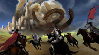
Paint effects and lights !!! As you can see, my design reference is from Cthulhu. But, i modified it a bit. If i paint the advanced version of it, maybe i would add wings. And for the smoke effect, just google smoke and set the layer to screen and voila! Or find smoke brushes.


And the rest is just adding effects (like J.J. Abrams's lens flare) and finishing.


For the guy in the left, it looks a bit stiff. I repaint it a bit so he looks like being pushed
away. And the painting is finished.

Conclusion : Painting mechs are fun. I must paint more !!! (Paintmore, it's a cool name lol)

And for the music, I usually listen to epic musics or scores like Hans Zimmer or Two Steps from Hell, thanks for my friend that used to play epic scores in our room . Sometimes it is very effective and sometimes not. You feel very powerful and unstoppable while painting. But, sometimes it is too powerful that you want to run outside, fly to outerspace and kill some monsters or aliens.

nb : no, that's not rashengan.

Thursday, June 6, 2013

The Process of Atzerria Fall

This is the process of a concept i made, Atzerria Fall

Backstory :
Hundred years ago, a small meteorite hit the surface of the earth creating a meteor crater. The crater's filled with tons of rare resources thus attracting lots of medieval legion and led to the outbreak of wars. The war killed almost a quarter population of the earth. Tired of wars, the remaining three legions formed a peace pact, shared the crater and named it "Atzerria Fall". They made three tall tower as a representation of the pact of the three legion. The enormous resources led to the beginning of the modern period. Technology developing fast and the industrial city became very wealthy and strong. Blinded by the great power and wealth, the leaders of the city became greedy. Thus making Atzerria Fall slowly turning into a dystopia.

The story is kinda lame i guess (i'm really a bad writer,except writing some humorous scene), but at least i got the concept.
First, i made thumbnails. (I forgot where my thumbs are 'cause i sketched them while daydreaming in class :p)
After i'm satisfied with the thumb and the ideas, i make a sketch with brush directly in Photoshop.
Then, i established the values, separating dark and light. I always paint spikes with lasso tool. It produces crisp edges and really easy to use. After i'm satisfied with the values, i hide the sketch layer (it also means i'm working on separated layer).


The next step is really fun, because this step makes your painting looked alive. I use blending modes like overlay, soft light, multiply, screen, and even normal layer to add colors. I combine several blending modes mainly to achieve colors that i like. In most cases, relaying only on one blending modes makes your painting become a bit dull and boring. Just my opinion though.
It's time to add details !!! I really forgot to add the four mining points (four towers) because i was too focused in making the main concept lol. That's right kids, getting carried away can lead you to do bad things.
I adjust the color a bit and then i added sky. Yeah, i really love painting sky that i forgot to save the process of the sky. Maybe next time. Can you notice the floating bra in the top of the main tower ? no, just kidding...

Painting the city was really painful yet fun. Sometimes i got carried away and paint toothpicks instead.
Add several lighting effects, and voilĂ  ! The painting is considered done !
For your info, no animals were harmed in the making of this painting.

Hope you enjoy the process, see ya :)

Saturday, June 1, 2013

Friday, May 10, 2013

The Process of Bima Satria Garuda

 This is the process of my Bima Satria Garuda Fan-Art  :

After a long time, i decided to paint from grayscale, because grayscale is fun :)
First, i made a sketch based on the design.
Then, i blocked-in areas with gray, then decided the lightsource and build the values
After that, i did the rendering, detailing and cleaning. This was the fun part. Try to think objects in 3D.
Next is coloring. I always use Overlay and Soft Light blend modes for coloring grayscale. Sometimes i use mutliply for darktones and screen for light.
Let's paint the effects to make it looks cool. I love this part. And i adjust the color and the contrast a lil bit.
After painting some texture and adjust the colors, this piece is considered done !
I made a GIF version of this process. Enjoy :)

Tuesday, May 7, 2013

The Making


This is the process of my last artwork :


First, i make a thumbnail based on my idea. The rough thumbnail is a bit hard to understand. It doesn't matter.
Then, i'm starting to block-in areas based on the previous thumb, defining light & shadow, perspective and did several color experiment. 


I also did a bit studies of smoke. For example, about the armor and what color smoke is. Fortunately, somebody has already found the answer. http://gurneyjourney.blogspot.com/2012/12/what-color-is-smoke.html (thanks alot).
Gurney explained that against a light sky, smoke will appear orange.


At this point, i felt that the color of the sky is not too good. So, i did some slight color adjusment to the image and make the sky brighter and more blue. After that, i did some rendering and details.


Add some more details, effects, motion & radial blur, smart sharpen, and the piece is considered done.

I hope this steps are helpful. :)

Wednesday, May 1, 2013